Some Q&A on the tricky comparative advantage (of interest rate swap) concept (this thread here) got me thinking about how much we can infer from the visual.
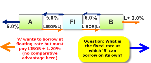
Here is a interest rate swap, like Hull shows:

Clearly, Company A (on the left) has an advantage in fixed-rate markets, where it (Co A) can borrow at a fixed rate of 6.0% (the left arrow out into the void signifies borrowing from capital markets, at the going rate). And Company B (on the right) has an advantage in floating-rate markets, where it (Company B) can borrow at a floating rate of LIBOR + 2.0%.
Question: given only two further assumptions:
Here is a interest rate swap, like Hull shows:

Clearly, Company A (on the left) has an advantage in fixed-rate markets, where it (Co A) can borrow at a fixed rate of 6.0% (the left arrow out into the void signifies borrowing from capital markets, at the going rate). And Company B (on the right) has an advantage in floating-rate markets, where it (Company B) can borrow at a floating rate of LIBOR + 2.0%.
Question: given only two further assumptions:
- Company A can borrow (on its own) in floating-rate markets at LIBOR + 1.20%, and
- The gains created by the swap are shared equally

 thanks for your help!
